Can a Pet App Create Real-World Connections?
Can a Pet App Create Real-World Connections?
Industry
Pet Care Community
Timeline
4 Months
Role
Product Designer

Introduction
Introduction
One experience, not four apps.
One experience, not four apps.
Tiny Tails brings community, walk tracking, weight goals, and gamification into one pet care experience, helping pet parents stay active with their pets while giving them a social reason to keep coming back.
Community
Activity
Progress
Rewards
Community
Activity
Progress
Rewards
01 / The problem
01 / The problem
Pet parents love staying active. Routines are hard to keep.
Pet parents love staying active. Routines are hard to keep.
Pet parents love staying active. Routines are hard to keep.
Problem 01
Progress feels invisible
Progress feels invisible
🐕
Walk completed
❓
Am I actually improving?
📉
Motivation drops
Problem 02
Tracking feels like a chore
Tracking feels like a chore
📱
Open app
📍
Track activity
🚪
Close app
Problem 03
Goals lack motivation
Goals lack motivation
10,000 steps
❌ A number isn't always motivating.
❌ A number isn't always motivating.
Problem 04
Pet parents already love sharing
Pet parents already love sharing
💬 "My dog finally completed a 5 km walk!"
💬 "My dog finally completed a 5 km walk!"
💬 "Look at her progress this month 🐾"
💬 "Look at her progress this month 🐾"
02 / The solution
02 / The solution
Turn pet activity into a connected motivation loop.
Turn pet activity into a connected motivation loop.
01 / 04 — Community Feed
Progress feels invisible
Progress feels invisible
The daily open layer, discover, share, stay connected.
The daily open layer, discover, share, stay connected.
Share pet moments
Discover milestones
Stay connected


02 / 04 — Walk Tracker
Connect individual actions
Connect individual actions
Profile, activity, weight and goals, in one place.
Profile, activity, weight and goals, in one place.
Walk → Updates
Progress → Unlocks
Rewards → Encourages
Sharing
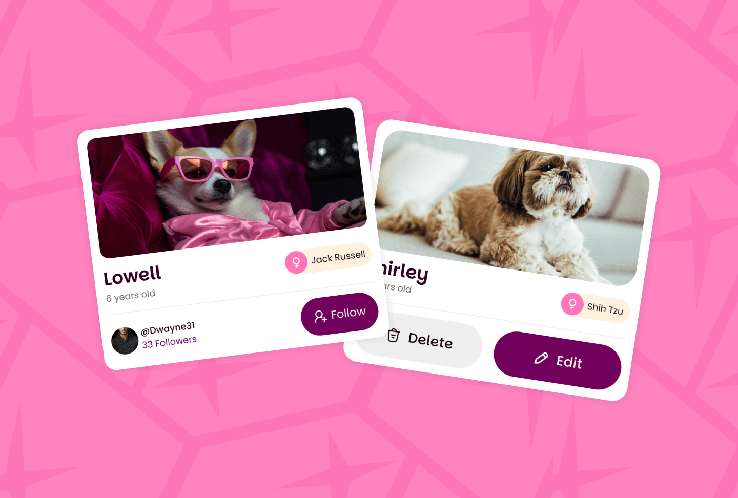


03 / 04 — Walk Tracker
Make progress visible
Make progress visible
Start and track a walk, turned into measurable progress.
Start and track a walk, turned into measurable progress.
❌ A number isn't always motivating.
❌ A number isn't always motivating.
❌ A number isn't
always motivating.
Clear progress
Achievable goals
Meaningful milestones


Badges & Leaderboard
Make progress visible
Make progress visible
Celebrate milestones, compare progress if you want to.
Celebrate milestones, compare progress if you want to.
Walk completed
Streak updated
Badge unlocked
Motivation increases


03 / Discovering the opportunity
03 / Discovering the opportunity
I didn't start with screens. I started with patterns.
I didn't start with screens. I started with patterns.
User interviews
User interviews
Affinity mapping
Affinity mapping
Competitor analysis
Competitor analysis
Product opportunities
Product opportunities
User interviews
User interviews
Activity trackers data, feels transactional
Social platforms engagement, no routine
If I can see we're improving, I'm more likely to keep doing it.
If I can see we're improving, I'm more likely to keep doing it.
Progress needs to feel visible.
Progress needs to feel visible.
Sharing what my dog is doing already makes the app more interesting.
Sharing what my dog is doing already makes the app more interesting.
Motivation needs emotional feedback.
Motivation needs emotional feedback.
A badge or streak gives me a reason to not break the routine.
A badge or streak gives me a reason to not break the routine.
Sharing already happens naturally.
Sharing already happens naturally.
Affinity mapping
Affinity mapping
Motivation
Motivation
Need a reason to keep going
Need a reason to keep going
Small wins matter
Small wins matter
Progress
Progress
Can't tell if it's working
Can't tell if it's working
Want to see change
Want to see change
Routine
Routine
Forget to log walks
Forget to log walks
Already busy enough
Already busy enough
Community
Love sharing pet pics
Love sharing pet pics
Want to meet other owners
Want to meet other owners
Rewards
Rewards
Badges feel fun
Badges feel fun
Streaks keep me honest
Streaks keep me honest
The strongest pattern wasn't a tracking problem. It was a motivation problem.
The strongest pattern wasn't a tracking problem. It was a motivation problem.
04
A community feed that gives a reason to return daily.
A community feed that gives a reason to return daily.
03
Consistency rewarded through badges and a leaderboard.
Consistency rewarded through badges and a leaderboard.
01
Walk tracking simple enough to fit an existing routine.
Walk tracking simple enough to fit an existing routine.
02
Weight and walk goals visible, so progress feels real.
Weight and walk goals visible, so progress feels real.
Competitor Analysis
Competitor Analysis
Puppr
Puppr
Dog training & care
Dog training & care
✓ Well structured training content
✓ Easy to use
✗ Limited social features
✗ No walk tracking
✓ Well structured training content
✓ Easy to use
✗ Limited social features
✗ No walk tracking
Opportunity
Combine training, tracking, and social in one place.
Combine training, tracking, and social in one place.
FitBark
FitBark
Activity tracker
Activity tracker
✓ Accurate activity tracking
✓ Good data insights
✗ Boring UI
✗ No community engagement
✓ Accurate activity tracking
✓ Good data insights
✗ Boring UI
✗ No community engagement
Opportunity
Make tracking engaging with gamification and social connection.
Make tracking engaging with gamification and social connection.
DogLog
DogLog
Health & medical
Health & medical
✓ Great for health records
✓ Medical reminders
✗ Outdated interface
✗ No social or discovery features
✓ Great for health records
✓ Medical reminders
✗ Outdated interface
✗ No social or discovery features
Opportunity
Enhance with modern UI and community features.
Enhance with modern UI and community features.
Social platform
Social platform
✓ Strong social community
✓ Easy content sharing
✗ Not pet focused
✗ No pet care tools
✓ Strong social community
✓ Easy content sharing
✗ Not pet focused
✗ No pet care tools
Opportunity
Offer a pet first social experience.
Offer a pet first social experience.
Wag
Wag
Dog walking
Dog walking
✓ Simple walk tracking
✓ Clean interface
✗ Only walk tracking
✗ No health or community features
✓ Simple walk tracking
✓ Clean interface
✗ Only walk tracking
✗ No health or community features
Opportunity
Expand beyond walks to become an all in one platform.
Expand beyond walks to become an all in one platform.
Activity focused apps
Activity focused apps
📊 Strong tracking
📊 Strong tracking
❌ Low emotional engagement
❌ Low emotional engagement
Community focused apps
Community focused apps
💬 High engagement
💬 High engagement
❌ Weak routine support
❌ Weak routine support
Emotional
Individual
connected
Functional
Community apps
Community apps

Tiny Tails
Tiny Tails
Activity apps
Activity apps
The opportunity was not another pet tracker.
It was a system that gives people a reason to keep going.
The opportunity was not another pet tracker.
It was a system that gives people a reason to keep going.
04 / Outcome
04 / Outcome
From isolated tracking to connected motivation.
From isolated tracking to connected motivation.
Before
Traditional pet tracking
Traditional pet tracking
Open app
Open app
Track
Track
View data
View data
Leave
Leave

After
Tiny Tails
Tiny Tails
Open app
Open app
Community
Community
Activity
Activity
Progress
Progress
Recognition
Recognition
Sharing
Sharing
Return
Return

05 / Reflections
05 / Reflections
What this project taught me.
What this project taught me.
Features don't create habits.
Connected experiences do.
Features don't create habits.
Connected experiences do.
Data alone isn't motivating.
People need to see what progress means.
Data alone isn't motivating.
People need to see what progress means.
Good design isn't about adding more.
It's about connecting what already matters.
Good design isn't about adding more.
It's about connecting what already matters.
