
Baracoa is an independent movie that has received recognition at international film festivals. The official website was created to support the movie release and showcase its awards, story, and visual identity.
Unlike a typical movie website that only shares information, this project aimed to create a cinematic digital experience. Every section was designed to reflect the mood of the film and make visitors feel connected to its world. From the opening screen to the ending, the website follows the emotion and visual language of the movie, making it feel like a journey rather than a simple promotional website.
Industry
Entertainment
Timeline
1 Month
Role
Web Designer | Framer Details
Key Focus
The main goal was not just to show movie information.
The website should make users feel like they are entering the world of the movie.
It should create curiosity, build emotion, and leave a memorable experience.
Delivered
Research
Information Architecture
Wireframes
Moodboard
Multiple UI Iterations
Final Figma Design
Responsive Framer Website
Research
Before opening Figma, I spent time understanding the movie.
I collected different types of content.
Movie synopsis
Official trailer
Movie posters
Important movie shots
Movie awards
Behind the scenes references
I watched the trailer multiple times to understand the mood, lighting, colors, camera angles, and pacing.
One interesting decision was using the first shot of the movie as the opening screen and the last shot of the movie as the ending section. This made the website feel like a complete movie journey.
Information Architecture and Wireframes
Once the research was completed, I planned the content structure. The goal was to tell the movie story step by step.
The sections were arranged in a simple flow.Header
Hero Section
About
World of Baracoa
Cast
Location
Music
Director & Crew
Gallery / movie stills
Director's note
Making of/BTS
Critics & media
Footer
Once the structure was ready, I created low fidelity wireframes to visualize the layout.
At this stage, I focused only on:
Section order
Content placement
Visual balance
Scrolling experience
I did not use any colors or visual styling. This helped me quickly test different layouts and improve the content flow before moving to the final UI design.

Moodboard
Before designing the interface, I created a moodboard.
It included
Movie frames
Lighting references
Typography inspiration
Color references
Texture ideas
Composition references
This moodboard became the visual guide for the entire project.
Whenever I designed a new section, I checked whether it matched the moodboard.


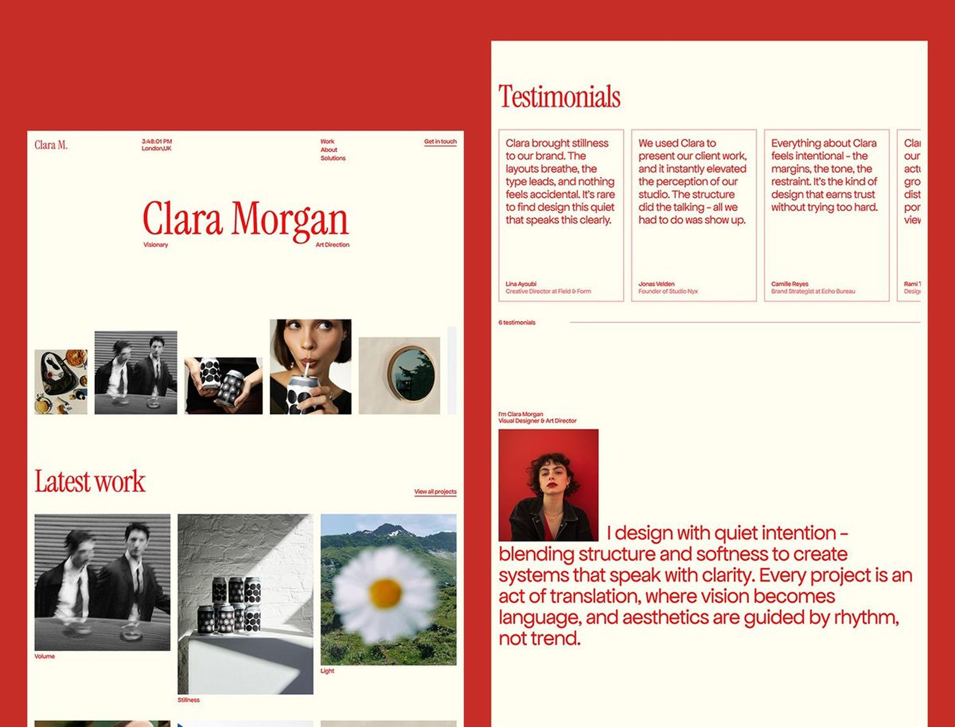


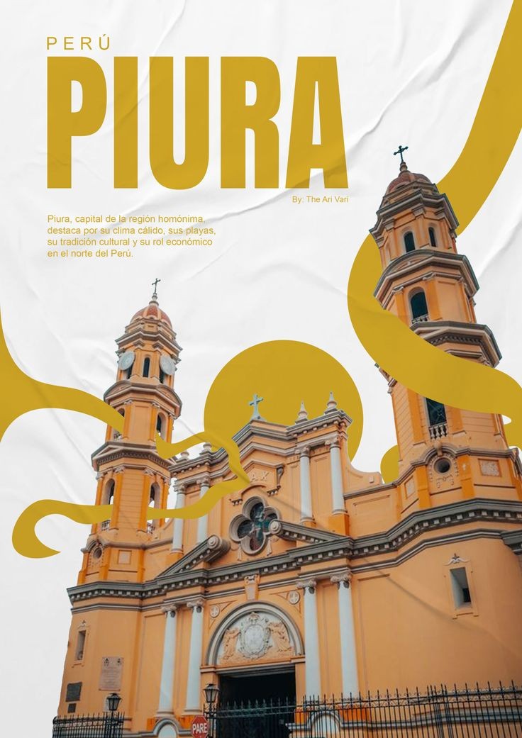


Moodboard
UI Exploration
This was the longest part of the project.
Instead of accepting the first design, I explored multiple ideas.
I created different layouts
I changed spacing.
I experimented with colors.
I tried different image compositions.
I refined every screen until it matched the emotion of the movie.
These design iterations helped me find the final visual language for the website.

Final UI Design
Once the visual direction became clear, I designed all the final screens in Figma.
The focus was on creating a cinematic experience.
Every section was connected with the next section so that the scrolling felt natural.
The typography, colors, spacing, and imagery followed the same visual language across the website.

Development in Framer
After completing the design, I developed the website in Framer.
The website was made fully responsive for
Desktop
Tablet
Mobile
Special attention was given to
Smooth scrolling
Page transitions
Responsive layouts
Loading experience
Background music
Performance
The goal was to make the live website feel as close as possible to the Figma design.
Final Outcome
The final website became more than a movie information page.
It created a cinematic experience where every section reflected the emotion of the film.
The project also helped me explore visual storytelling, mood based design, and turning a movie into an interactive web experience.